Trends & Best Practices in Mobile App Design for 2022
Mobile app development process evolves before our eyes continuously. One of the main aspects that exhibits this transitoriness is none other than mobile app design. The changing trends that figure in it on an almost yearly basis underscore that fact more.
Below, we’ve shared the ones that will most likely dominate the year 2022. We’ve complemented them with an overview of the different types of apps based on perspective, best design practices, and possible mistakes to be mindful of.
Types of Mobile Applications
The type of the app greatly dictates its design. You, as a user, probably already know the numerous categories that distinguish apps from one another. There are apps intended for gaming and entertainment while there are others that serve a more practical purpose. This is how we usually categorize apps based on their content.
On the other hand, there’s the technical perspective. It’s usually how most developers view their creations.
1. Content Perspective
An education app would more than likely look different from the one that’s intended solely for business and finances. The same goes, for example, in weather apps. You will only be given relevant information like the current humidity, temperature, and forecasts.
- Lifestyle apps help you in your fashion, parenting, and real estate decisions.
- Nutrition apps let you plan your diet and keep track of it.
- Game apps immerse you in your favorite gaming environments, may it be casual or competitive.
From a content perspective, we look at how each app will help us solve a problem or fulfill a particular purpose. Of course, the ones we mentioned above are just some of the main types of apps available at present.
2. Technical Perspective
When developers look at apps and how to enhance their respective user interfaces and experiences, they either arrange them into silos such as native apps, web apps, and hybrid apps.
- Native apps run on a single operating system like Android, iOS, or Windows. Some mobile app developers still prefer to go native because of the assured top-notch performance, openness to various API options, and better overall user experiences.
- Hybrid apps hit two or more birds with one stone because they’re developed to run on multiple platforms. They do carry a downside in that, compared to native apps, they tend to be subpar in performance.
- Web apps are hard to beat when the topic is optimal user accessibility. You don’t need to download them so they don’t take up storage space and require only a browser to access all their features. They’re not without their cons like overreliance on the quality of internet connections and limited API options.
Mobile App Design Principles & Best Practices
Now, let’s discuss the actual design practices that every developer pretty much needs to adhere to.
-
Animations and Microinteractions
There’s no other alternative at present that is as attention-grabbing as animations and micro-interactions. For example, real-time changes in color and other screen elements based on the users’ actions boost both app personalization and engagement, too.
-
3D Object
Equally eye-catching 3D models offer a more realistic experience, as they allow users to view content and products similar to how they do so in the physical world. They dispense vital information faster, too.
-
Dynamic UI Style
Dynamic UI focuses on optimal user convenience when interacting with your app. For example, a more dynamic UI saves users plenty of time customizing a particular product or setting its parameters by erasing the extra, unneeded steps to perform them.
-
App Colour Schemes Trends
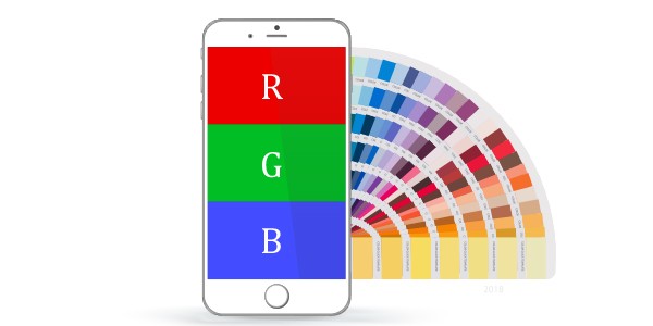
Learn to balance the use of bright colors. Dark mode works, as well as minimalism. These may be trends but they’ve proven their longevity as evidenced by the number of apps still adopting them.
-
DeclutterApp Colour Schemes Trends
Few things are more disappointing (if not overwhelming) than not allowing room for whitespace in your app. Aim for simplicity in the hues you choose, add borders and lines where necessary, and figure out the right sizes to use for text and imagess.
Create the State of the Art UI & UX for Your Mobile App with the Help of Experienced Professionals!
Dot Com Infoway’s UI/UX team follows the latest design trends to create the best layouts for your app. Talk to us now!
Things to Avoid While Designing Mobile Apps
In Mobile App UI/UX, there are methods that you won’t go wrong with. there will be those that you should steer clear of. Here are four that you should avoid at all costs.
-
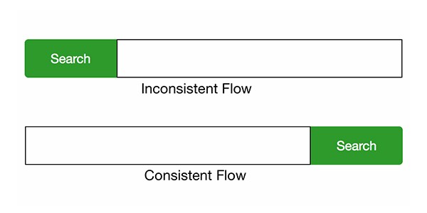
Ignoring User Flow Optimisation
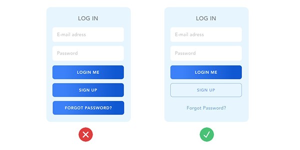
In design, failing to plan this is like heading to a battle you’ve already lost from the start. Navigating the app should feel as smooth and unrestrictive as possible. Always focus first on how your app’s UI will be organized before diving into the details and aesthetics.
-
Design Inconsistencies
An obvious lack of uniformity is jarring. In the same manner, using different designs can only go so far in doing good for your app’s overall design. It’s important to strike a balance between these two fundamental elements.
-
Wrong Usage of Push Notifications
You can’t go on mindlessly sending too many to your users. That will only turn them off, in the same way, that sending too few notifications will. Pay equal attention to the content of each notification as you don’t want them to contain any trivial stuff that your users will not find useful.
-
Poor UI Experience
Nowadays, many developers consider this a mortal sin in app design. What good will an aesthetically-pleasing app do if it serves a largely practical purpose? More often than not, choosing simplicity paves the way to a better, more magical UI. AI-powered anticipatory app design is another promising trend.
Top Trends in Mobile App Designing 2022
These trends should more or less give you a glimpse of where app design will be headed going forward.
-
Minimalism
The minimalism trend has been around for quite a while, and the fact that it’s still going strong proves just how reliable it is. Minimalism in the context of app design is largely about relying on uncomplicated shapes, color palettes, and negative spaces.
-
VR / AR
Either of these two provides unique and convenient experiences to users. That being said, these technologies fulfill a more practical purpose. In navigation apps, for example, AR can greatly reduce cognitive load. Virtual reality shines a lot in its ability to impart a first-person perspective, thereby providing the most immersion in the digital world.
-
Screen Alternatives
This trend involves giving users more than one way of viewing content. It’s not just concerned about laying out the app for various screen sizes but getting a unique experience or content altogether once they shift between screen options.
-
Neumorphism in UI Interfaces
Neumorphism adds a head-turning realism to the app’s interface. Basically, it’s a combination of flat design and skeuomorphism to give objects the illusion that they have raised shapes. Not only are they eye-catching, but they’re generally pleasing to look at as well.
-
3D Geometric Design
3D geometric designs are as cost-effective as they are engaging. Many designers actually consider their creation as a showcase of skill, so it’s not surprising that many are practicing on these types of designs.
-
Trendy Mobile UI Styles
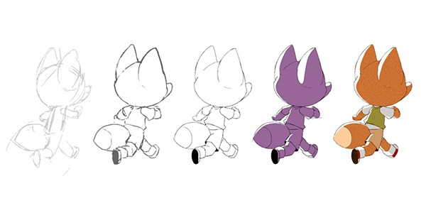
These can range from something as no-nonsense as making complex data easier to grasp by using pictures and graphs to relying on styles that invoke childhood memories and calming feelings, such as the respective rises of app Kawaiization and the use of cartoon illustrations.
Conclusion
We hope that this comprehensive guide gives you useful design insights and puts you up to speed on what works in 2022. At best, there will be evergreen practices and principles just as there will be trends that will rise and fall over time. The important thing is to stay up-to-date about them, just as you did here.

