DCI logo gets a makeover, makes things simpler
‘Keep it simple’ is an adage we have been following from our very start. Now, our logo and brand message too reiterate the simplicity of our business approach.
Dot Com Infoway’s logo went through a design makeover recently. Top design minds of the company were working for months at the new logo. After a multitude of suggestions, rejections and changes, we arrived at the third generation logo of the company (which you can find below).

The new logo signals our simplistic and straightforward approach to clients. Rid of complexities, the new logo implies that, as a company, we want to make things simpler and less complicated for businesses.
This re-branding is also representative of our successful, heads-up ride through recession times. We have removed the zero-like symbol in our logo to drive home the message that we sailed triumphantly through the recent economic meltdown and have the potential to override any future global crises too. In addition to all these, the logo’s futuristic outlook signifies our evolution from a fledgling startup to a premier, innovative IT company of international repute.
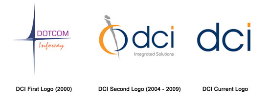
For those who are interested: Just as Apple evolved from its Newton image and VIBGYOR Apple to a metallic, silver Apple, and Google shred its primitive crayoned letters and exclamations to arrive at a stylish, corporate outlook, Dot Com Infoway’s logo too has seen three generations. Below is a graphic representation of our logo’s evolution:


