eCommerce CRO Checklist: 20+ Tips To Improve Website Conversion Rate
As any seasoned digital marketing agency will tell you, investing in an eCommerce CRO is one of the most important keys to success. Just think about it, even a single 1% increase in CRO already connotes doubling the profits of any eCommerce store in most cases. It’s no wonder owners meticulously craft and check their eCommerce CRO Checklist and hire the best agencies to get that coveted 1% (if not more!) bump.
The icing on the cake is that the benefits rarely stop there. It also improves your bottom line, cuts back costs, and improves overall efficiency-all the good things, in short. So without further ado, let’s dive right into this topic.

The Essentials of eCommerce Conversion Rates
First, let’s discuss the essentials. For one, you need to be able to know how to calculate your conversion rate. Start with this formula:
Total conversions / total visitors x 100%
Does paying more attention to conversion beat focusing on traffic? Just ask anyone who has launched a successful CRO campaign, and they’ll answer this with a resounding yes.
Quality beats quantity; however, the most ideal direction to take will always be to increase the conversion rate of eCommerce and increase traffic at the same time in the long run.
Regarding Bounce Rates
Bounce rate will always figure into conversion rate, so expect most eCommerce CRO strategies to account for it. Technically, it pertains to the number of visitors (in percentage) that leave your website after viewing your page, so it’s a value that we need to keep as low as possible. Take note that the average bounce rate for eCommerce is 47%.
As for how you can keep it low, there are time-tested methods like improving site speed, providing easy, accessible support through live chat, and improving overall navigation. That’s only the tip of the iceberg, obviously.
This eCommerce CRO Checklist should provide you with a better, more complete overview of how to reduce bounce rate and boost your conversions at the same time.
The Ultimate CRO Checklist Every eCommerce Website Should Have
Keep in mind that the average conversion rate for eCommerce is 2.63%. Aim to come close to that figure incrementally. We can safely say that you can do so nicely and slowly if you stick to the pointers we’ve shared here.
Take Note: Every point included in this list, if done correctly, will contribute toward improving conversion rates. You’ll be able to see the results gradually as you introduce them.
A. Sitewide Optimization
This pertains to paying attention to every element on your site that may boost or hold back conversions. Most site owners go the usual route of improving their site’s overall navigation by removing unneeded elements and keeping the user’s journey as smooth as possible.
This includes cart optimization that involves deciding where to place the cart icon, what page the user will be taken once they click on it, using the right copy, and choosing the best colors.
i. Sitewide Search
This involves giving the option for users to search for products easily. You can, for example, narrow down their searches from the get-go by providing the option to search by category, name, or price. Be mindful of the size of the search box, too, and how it blends with your site’s layout.
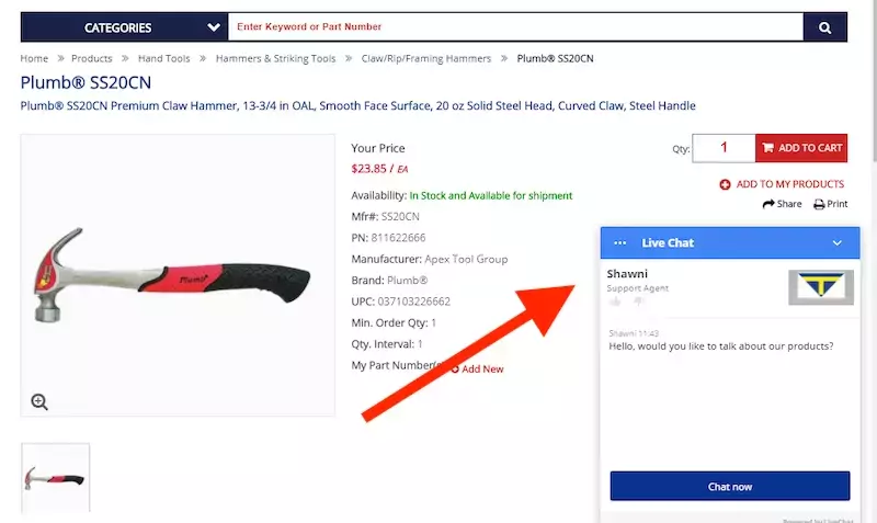
ii. Live Chat
Sites use chatbots because it helps to save time and effort for actual customer support personnel. The best ones are those that are able to direct visitors easily to the products they need and answer inquiries fully.
iii. Related Items Based on User History
This is essentially upselling, which only boosts your AOV. The page should readily display the alternatives that are directly related to the product the visitor is considering.
There’s no better example of this than the one used by Amazon and almost any other major e-commerce store out there.
B. Homepage Optimizations
The eCommerce homepage is basically an online shop-window, so it has to make a great impression from the moment the visitor lands on the page.
Obviously, feedback matters a lot. This is why most owners take the opportunity to include past reviews to convince visitors, some even in the form of images. Home page navigation also encompasses optimal navigation, so it’s recommended to ensure organization through product categories.
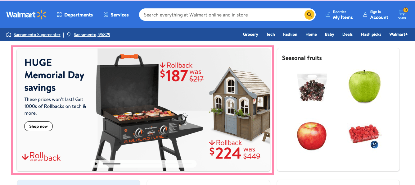
i. Hero Banners
Hero images deserve the name they get because they’re the first images that the visitor sees. Use attractive images and clear, concise copy to inform your users.
ii. Primary CTAs
Keep your user engaged and direct them toward an important action you need them to take. Don’t limit yourself to the ‘Buy Now buttons. Use copy, colors, and styles that are as eye-catching as possible based on site UX.
iii. Highlights
Placing importance on elements and products on the page is another undeniable step to improve eCommerce conversion rates. Think of any kind of important aspect that needs the highest attention, including reviews and offers and discounts.
C. Product Category Optimization
Naturally, everything you offer should be properly sorted into detailed categories, especially if your entire catalog is relatively varied already. Pay attention to eCommerce SEO by practicing keyword optimization that SEO Services abide by.
Ideally, the images you use should be adjusted accordingly in order to save on your website real estate. Just don’t let them get too small enough to not make an impact or large enough to affect other on-page elements, especially the crucial ones.
Category CTAs with catchy offers should also be considered if you want to encourage visitors to check your items out. Enhance your copy over time.
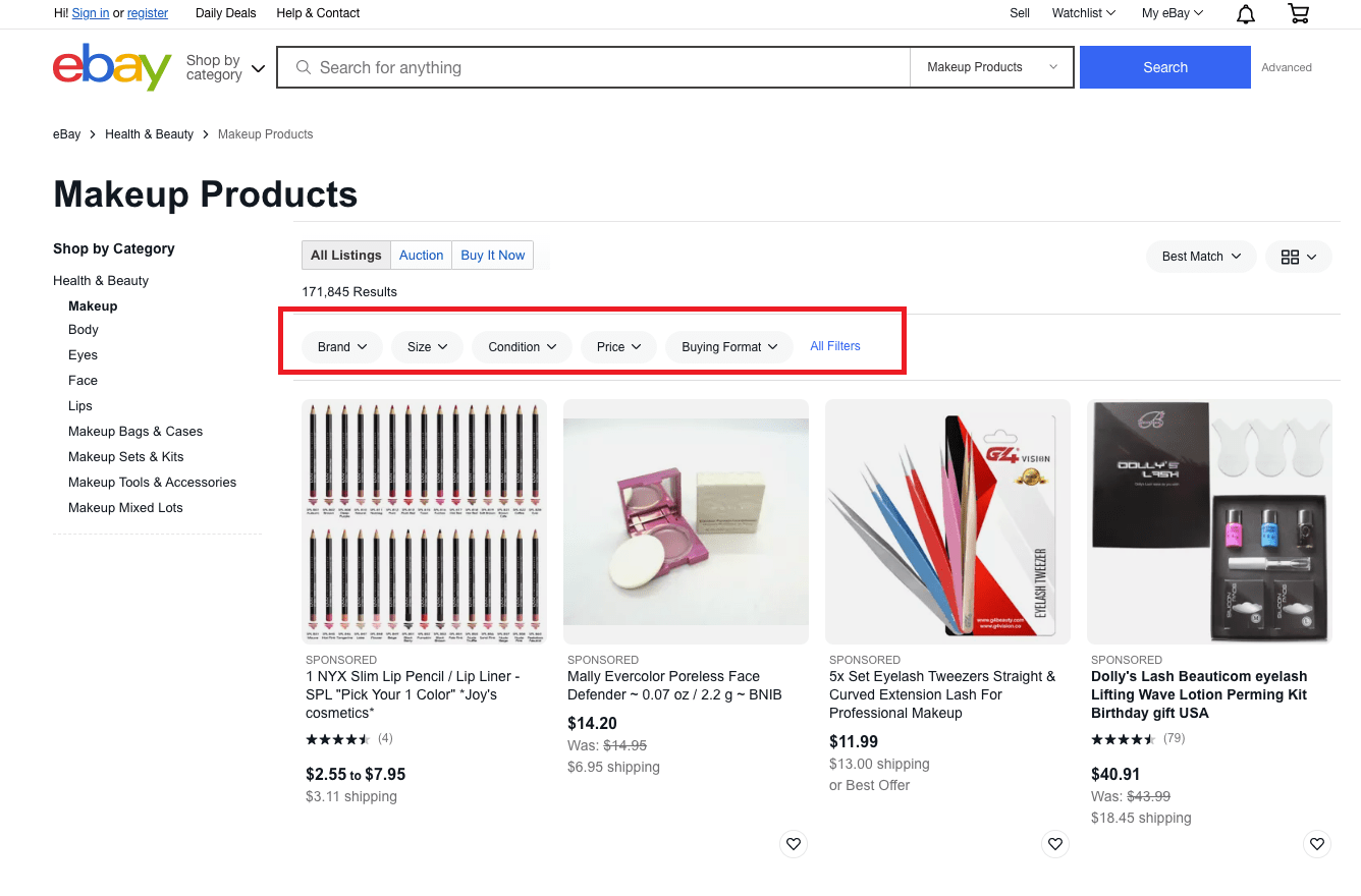
i. Filter Options
Give the option to filter based on price, category, feedback, etc. Beware of creating too many filter options, though, since they may negatively affect the browsing experience as well.
 ii. Product Layouts
If you’ve been into digital marketing for eCommerce for a relatively long time now, you’re already aware of the importance of layouts. How will you present your products to your users?
This often goes hand in hand with product categories in most eCommerce sites. They can, for instance, click on one or more categories to filter out results while proceeding to juxtapose the products, so the user can easily compare them with one another.
iii. Sidebar Navigations
Not all sites that include sidebar navigation benefit from their addition, so this really takes a bit of A/B testing from the start. Part of why certain eCommerce conversion optimization services dissuade this is because they may end up overwhelming the visitor with choices.
If you have fewer products than most stores, then this might work to your advantage.

Improve Online Sales With Our eCommerce CRO Services
For eCommerce brands, we quickly create, optimise, and test high-converting digital experiences. Custom conversion rate optimization tactics will increase your online sales. Contact our digital marketing specialist & improve your conversions.
D. Product Page Optimization
Your product page contains all pertinent information regarding what you offer. Keeping the visitor informed about what to do and the options available to him or her is one fundamental step to ensuring eCommerce product page optimization.
Give them the option to easily access an item that catches their fancy by integrating a wishlist feature. Being able to add to a cart with a single click of a button reduces overall shopping time. Keep giving them options by adding a related items section.
i. Product Value Proposition
Consider whether you need to highlight the perks of buying a specific product or simply settle for describing it.
ii. Image Hover
Users should be able to check a product’s physical aspects out in greater detail, and there’s no better way to do this than with the help of the image hover functionality. This is arguably more important in certain niches.
iii. Reviews & Ratings
Everyone trusts first-hand feedback, so this is practically a must. Ecommerce conversion rate optimization hinges a lot on providing authenticity to visitors in order to build trust. This is one of the few important ways you can do this.
E. Shopping Cart Optimization
A pivotal part of any eCommerce CRO Checklist, high cart abandonment rates are one of the main reasons why a lot of stores fail.
To prevent this, you need to pay attention to product page optimization, as stated above as well as the other factors mentioned here.
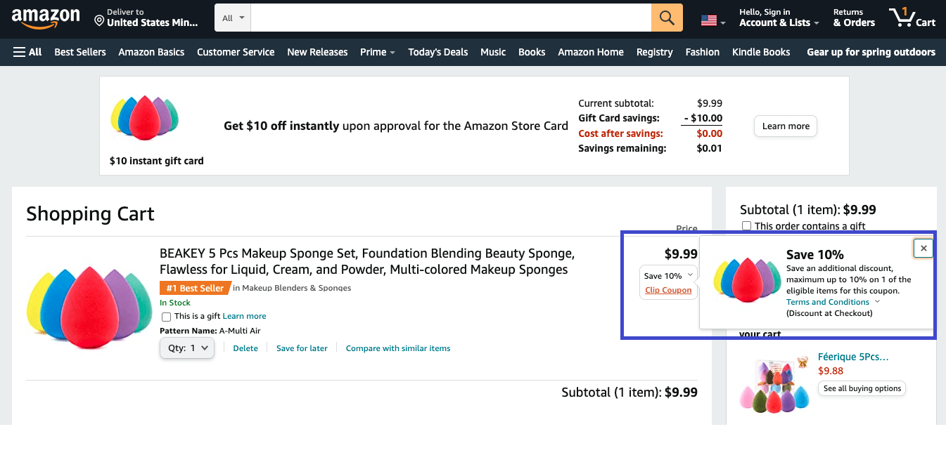
i. Discount Codes
Give a list of every valid discount code when the visitor is viewing his or her cart. Decide the best times to offer them.
ii. Shipping Details
Include every pertinent information regarding shipping, especially costs, time to delivery, etc. The point is don’t be stingy with details but includes only the ones that matter.
iii. Reviews & Ratings
Even as the user is checking items on his cart, he should be able to have easy access to the reviews and ratings it has gotten. You can even increase the conversion rate of eCommerce by adding giving them the option to compare ratings between the items they’ve added to the cart.
F. Checkout Optimization
Proper conversion optimization for an eCommerce website is never complete if you don’t pay attention to the tail-end of the shopper’s journey. Should you include guest checkout for faster transactions? Be sure to test that out along with the following essentials:
i. Payment Options
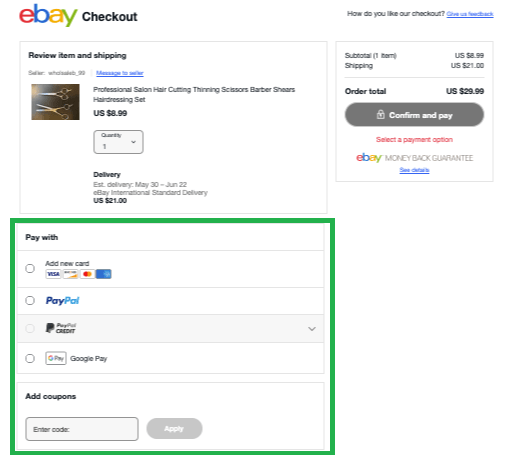
Obviously, it’s great to have more than one way to pay for products. However, you have to decide whether it’s right to inform your customers about everything that’s available to them from the moment they’re adding products to their cart or during the actual checkout process.
ii. Promotion Code Entry
Offer the ability to add discount codes that you’ve promoted or are readily offering as a list during the checkout procedure. Better if they don’t have to manually type them and can be inputted with a single click or tap.
G. Dashboard Optimization
Any eCommerce dashboard should aim to be as all-encompassing as possible when it comes to informing the user regarding his orders and past shopping history. Take the opportunity to attract them with offers as well.
i. Upsell CTA
Even from the dashboard, you can still add CTAs that will increase conversion rates. For instance, you can attract them with present offers even as they’re reviewing their shopping details or checking their orders.
ii. Order Status
Be transparent when it comes to revealing information regarding the items they’ve bought, such as where it is now, ETAs of delivery, etc.
H. Thank You Page Optimization
Showing gratitude for your customers’ patronage is always a good thing. Just be sure to not miss the best opportunities to do so and consider ways you can do more promotions as you send them.
i. Confirmation Mails
On most sites, these are automatically sent once the product has been purchased. Use everyday language to express your gratitude. More importantly, provide key information such as tracking numbers and ETAs.
ii. Social Sharing CTAs
In the confirmation mail, you can encourage buyers to share what they bought via social media. You can add how many users have bought the products so far. What’s great about this is that it contributes to social proof, which goes well with feedback in boosting trust.
Conclusion
We hope that you now have a solid idea of where to take your campaign with this eCommerce CRO Checklist as your guide. Not every site is obviously alike, so you definitely have plenty of A/B testing to do.
Dedicate yourself to taking consistent action, and you’re likely to learn more in the process. Let these conversion optimization tips for eCommerce websites serve as your constant, reliable reference.

 ii. Product Layouts
