Top 10 Web Design Trends to Watch Out in 2018
6 mins read
Web design has a rich and inspiring history that goes back to the very early 1990’s: In fact, the primitive years of 1990 to 1994 saw a unique focus on sites with mere plain text until images and other forms of content began to slowly emerge alongside them in 1993. That year, Yahoo first came into the picture as well and began a revolution of its own.
The early web design trends, at the time, began to incorporate the first batch of web-safe colors, offered in unique palette schemes; then followed more text-loaded sites with browsers, common monitor resolution and, ultimately you’ve guessed it, HTML. We’ve come a long way as a digitally enhanced society, but we have still many new worlds to explore, and 2018 holds the next step forward, so pay attention to all that it’s promised to offer in terms of web design trends. There’s much in store, and the following are 10 unique selections worthy of utmost attention.
10 Unique Web Design Trends to Note – Watch with Great Anticipation
- Asymmetrical Grids
“Perfect Symmetry” is a thing of the past. Let’s face it. Now it’s all about the split-screen designs, which we’ll cover in just a bit, and getting that perfect half/half visual outline going forward.
- Fluid Shapes
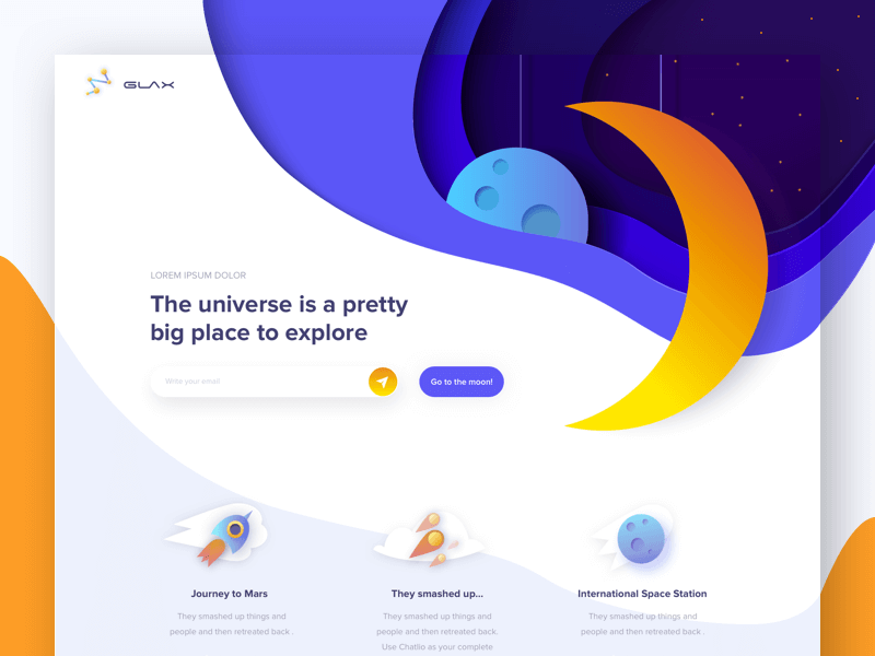
In 2017, things were slightly different. Geometry and sharp poly shapes took over. But things are expected to take a more fluid turn this year around. Shapes with visually smooth curves in each area of the design are remarkably enticing.
- Brighter Colors
More bright color — who wouldn’t want it? This ever-growing need only manifests itself with growing voracity. It’s time to keep up with the trends!
- Bottom Sticky Elements
You ever notice those minimally placed, minimal size ads that tend to accrue at the bottom of your app? Well, they’re there for a reason. It’s all a part of the greater marketing picture, friend! Pay attention to them when you see them next time. Note the unique advertising or promotional message and scope behind each one you see.
- Voice/Natural Language Search
Remember. Web design’s not fully visual. A great portion’s still audible. Creating an easy, simple user interface made to properly interact with voice commands does not pose the plethora of challenges it once did.
- Subtle Animations
Small and simple animations, contrary to popular consensus, can mean everything. They can be just what people need in terms of visual attraction to offer a delightful surprise to each visitor. Plus, they promote active design engagement in place of pure content/textual engagement and analysis. Welcome to the visual world of wonders, folks, one that’s apparently here to stay.
- SVG Images
SVG here stands for Scalable Vector Graphics, an innovation only more and more common these days. Scalable Vector Graphics involve lightweight images of a vector configuration that collectively put icons, logos and even graphics together into “pixel perfect” combination, at least in regards to both resolution and overall screen size. Any hi-res displays can positively contribute to this file format’s gradual rise, so take note. It’s a thing of beauty or should we say, a thing of the future.
- Split-Screen Desktop/Stacking Mobile
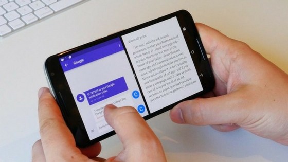
Split-screen design patterns have become “all the rage these days”. The last couple of years, on their own, have proven this. Just look at the sales and revenue behind the mass purchases of these. People want service and optimization with quality, and they’ll pay top dollar to get it. Split-screen helps, toward this end, on many levels.
The more comfortable one can work, or play, or browse the Internet in general, the better; he or she will even pay more to make this possible. Split screens offer a more enjoyable work or basement, or even home office, environment as well. Some Web development companies probably says the same.
- More Scrolling Animations
Parallax scrolling animations are one thing. Yes, many innovation developers have recently put them on the back burner, but this doesn’t mean scrolling animations, in general, should be removed from the forefront as well. This is a mistake many have tended to make, tossing out the baby with the bath water, in a technological sense, of course.
In other words, numerous ways to engage users through scrolling still exist; the possibilities are nearly infinite though I did say nearly. Furthermore, one can still add a balanced touch of parallax to the scrolling without throwing in too much — moderation is key here as it is with all successful things in life.
- White Space without Minimalism
There’s often a challenge that needs to be met head-on. Designers adore using white space! They literally can’t get enough of it, but on the other hand, clients and other experts may prefer minimalism in this respect; where do we achieve balance, then? The compromise, then, must involve a design with copious white space but also one with a reduced minimalist feel. Yet one can include more design elements and colors to any design with plenteous space, and boom it’ll feel “truly full”.
Conclusion
Indeed, the Internet has come a long and glorious way since its first maternal inception in 1990, so to speak: The Web is a baby that has grown and matured but has still far more ahead in store. It holds a bright and glorious future, much of it lying within web design and its untapped potential, particularly among special trends like the 10 we’ve just reviewed —- asymmetrical grids, brighter color offerings, bottom sticky elements, voice or other natural language search functions, fluid shapes, subtle animation, SVG images, split-screen desktop/stacking mobile, additional scrolling animations than previously held, and even white space without the unneeded “minimalism”. It’s a great time to own a laptop, phone, tablet, or desktop computer. Pretty soon, it may become the only way to truly connect to what’s new in this world, if it’s not already. God bless the Internet!
Latest Posts
Get the latest insights from Dot Com Infoway straight to your inbox.




![The Game Marketing Guide: Pre and Post-Launch Strategies [Infographic]](https://www.dotcominfoway.com/wp-content/uploads/2023/09/DCI-Game-Marketing-blog-1.jpg)

