The Ludo UI – Case Study Mobile Application Development
Introduction
Ludo is easily one of the most popular board games people usually play indoors. You may never remember a summer holiday without playing Ludo with your siblings, your cousins, or even with your parents.
The game of Ludo is played with a mix of chance and strategy. You roll a die (singular for dice) and you may get any number between 1-6. Based on the number you get, you make your moves.
What number you get depends on chance and what moves you make, depend on your strategy. This is the entire crux of the game of Ludo.
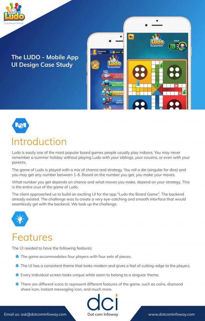
The client approached us to build an exciting UI for the app “Ludo the Board Game”. The backend already existed. The challenge was to create a very eye-catching and smooth interface that would seamlessly gel with the backend. We took up the challenge.
Features
- The game accommodates four players with four sets of pieces.
- The UI has a consistent theme that looks modern and gives a feel of cutting-edge to the players.
- Every individual screen looks unique while seem to belong to a singular theme.
- There are different icons to represent different features of the game, such as coins, diamonds, share icon, instant messaging icon, and much more.
Challenges
All four sets of pieces must look unique with a solid, 3D look.
- The game interface must contain bright and vibrant colours to distinguish between different sections and different states.
- Every element of the game must be distinctly visible.
- The dice must give a three-dimensional look.
- The animation must be smooth and the graphics shouldn’t smudge during the animations.
- Although the entire Ludo board must be visible on the tiny phone screen, individual pieces should be easily movable with a finger.
How we took up the challenge
Whether we are building a complete application or a backend, or a front-end, as was the case in this case, we follow a standardized procedure to deliver our best service.
Our project manager and graphic designer spent an ample amount of time with the client going through the fine details of the mobile app. It was particularly important for us to understand the profile of the users/players and the sort of devices they will be using to play the Ludo board game.
Once all the information was with us, our graphic designer started building individual items.
We first created a prototype to show it to the client. A prototype is very crucial because it gives the client a clear idea of how the final interface is going to look and feel.
When the client approved the prototype, our graphic designer started working on individual elements and screens. We were able to complete the entire UI within the agreed-upon timeframe.
To give a 3D look to the pieces and the dice of the game we used [name of the software]. For rendering and sketching, we also used [name of the software].
The client was easily able to integrate the UI with the backend.
Results


