Challenges
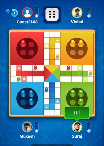
All four sets of pieces must look unique with a solid, 3D look.
- The game interface must contain bright and vibrant colours to distinguish between different sections and different states. Every element of the game must be distinctly visible. The dice must give a three-dimensional look.
- The animation must be smooth and the graphics shouldn’t smudge during the animations. Although the entire Ludo board must be visible on the tiny phone screen, individual pieces should be easily movable with a finger.

Our Solution
The UI needed to have the following features:
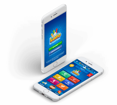
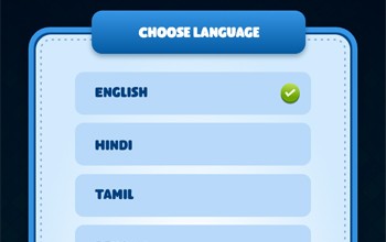
- The game accommodates four players with four sets of pieces. The UI has a consistent theme that looks modern and gives a feel of cutting-edge to the players.
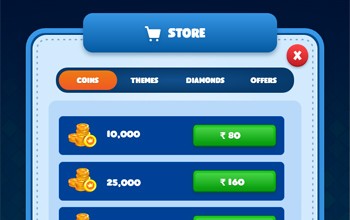
- Every individual screen looks unique while seems to belong to a singular theme. There are different icons to represent different features of the game, such as coins, diamonds, share icon, instant messaging icon, and much more.
Our Results
The client is extremely happy with the UI that we developed. The UI was exactly how they had expected, and, in some cases, we even exceeded their expectations. The UI, as the client says, truly represents the spirit of the Ludo board game. They are looking forward to launching the game.
Tools and Technologies



What Our Client Say’s
Lorem Ipsum is simply dummy text of the printing and typesetting industry. Lorem Ipsum has been the industry’s standard dummy text ever since the 1500s, when an unknown printer took a galley of type and scrambled it to make a type specimen book. It has survived not only five centuries, but also the leap into electronic typesetting, remaining essentially unchanged.
Lorem Ipsum is simply dummy text of the printing and typesetting industry. Lorem Ipsum has been the industry’s standard dummy text ever since the 1500s, when an unknown printer took a galley of type and scrambled it to make a type specimen book. It has survived not only five centuries, but also the leap into electronic typesetting, remaining essentially unchanged.

