Challenges
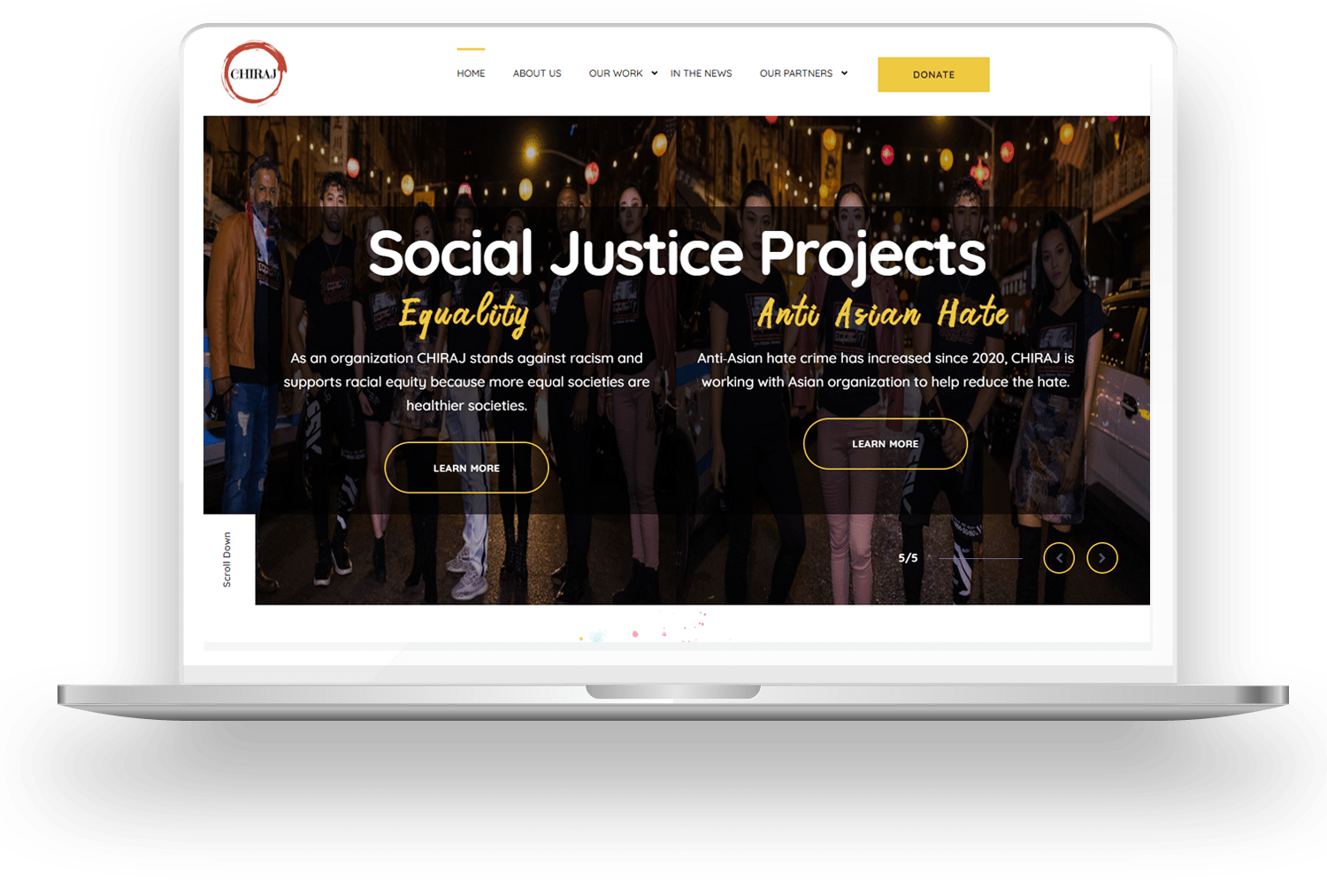
The nonprofit organization was in the process of changing its domain from chiraj.com to chiraj.org (a more appropriate domain extension for nonprofits). They wanted to use this opportunity to upgrade their website in terms of
- Enhanced UI/UX: They wanted to provide a rewarding user experience to their website visitors that include volunteers, partners, health agencies and finance & resource contributors.
- Easy navigation: The website must be easy to navigate with all the crucial sections on the website just a couple of clicks away.
- Easily accessible content: The information is vital for the website. People get motivated and inspired as well as informed. Therefore, it was important that its content was easily accessible on the web as well as from mobile phones.
- User-friendly, secure CMS: They wanted to be able to update the information through a content management system, in a secure fashion.
- Quick checkout process: For donations and other items being offered on the website, the NGO members wanted a quick checkout process.
- Secure payment gateway: To enable people to give donations and buy items from the website via credit cards and other online payment modes, the client wanted to integrate a secure payment gateway.
- Secure admin panel: The client wanted a centralized and secure administration panel that would give access to all the assets of the website.
Our Solution
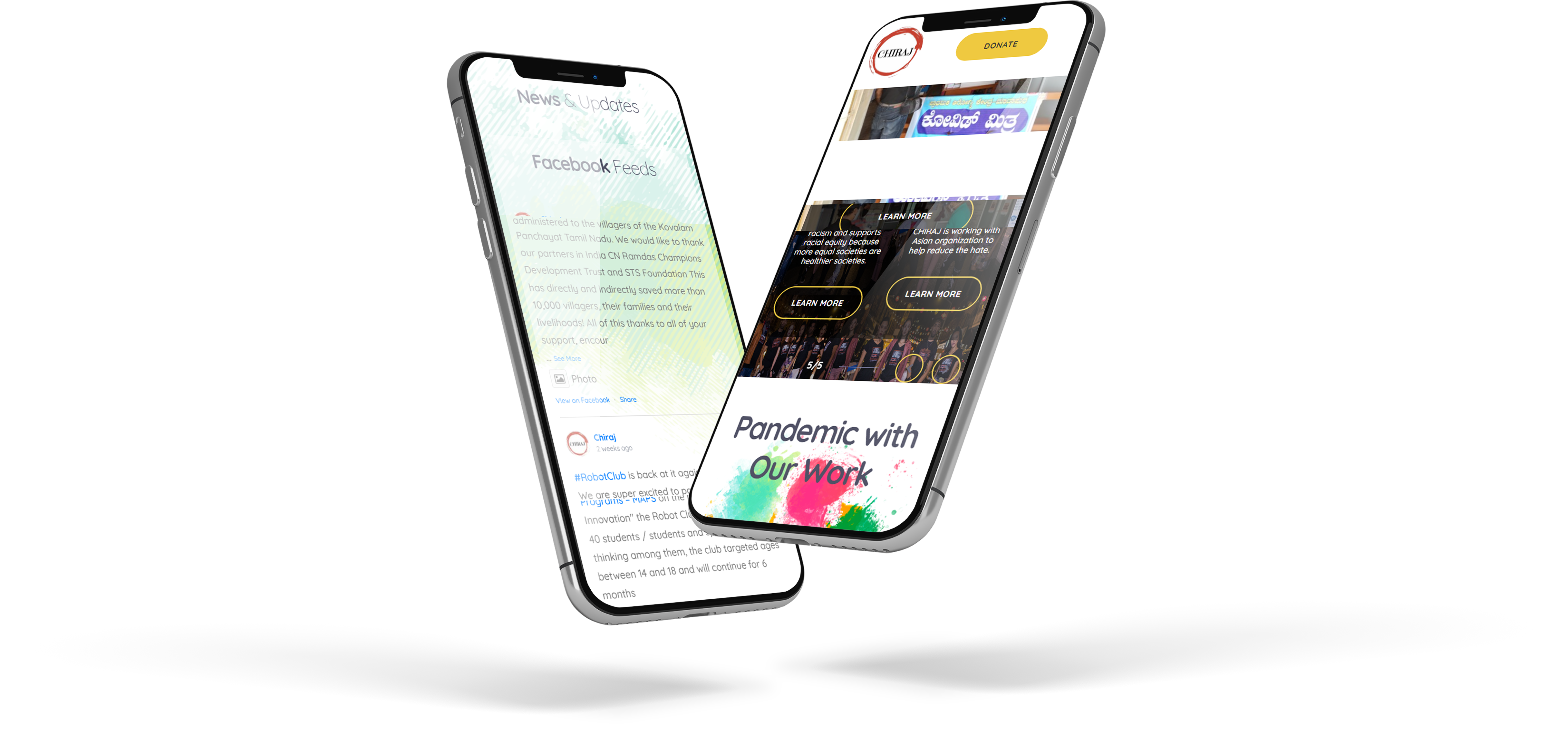
The design and development team at Dot Com Infoway didn’t want to leave any stone unturned in their pursuit to provide the perfect solution to the client. This is how they deployed the new website.
Phase 1:
Phase 1 involved analyzing the aspirations of the client and understanding what difficulties they were currently facing. It needed to be kept in mind that the website must be designed not just for the client, but also for the end users.
- Problem/solution analysis: Through web conferencing we held multiple sessions with the client to clearly understand their expectations.
- Wireframing and prototyping: We wanted to give a real sense of the end result to the client before jumping head-on to the design and development process. Through high-grade wireframing and prototyping the client was able to experience how the website would look and feel.
- Design finalization: The client and the design team finalized on the layout and the components of the website including the CMS to be used – WordPress.
Phase 2:
It’s the phase 2 during which we begin to lay the foundations and start building the website element by element, code by code. Below we present the approach that we followed.
- WordPress: We ported the entire existing website, including existing content, to the WordPress CMS with a secure admin panel.
- Theme and layout: We created an easy-to-navigate WordPress theme using all the design element suggestions made by the client.
- Payment gateway integration: With our secure payment gateway integration the client was able to accept donations and other monetary contributions through the website via multiple payment modes.
- Web standards: The website needed to be completely accessible according to international guidelines such as WCAG and W3C. It was a responsive design that looks great on all screen resolutions and screen sizes.
Our Results
Chiraj.org is a thriving website now. The traffic has increased. They're adding new information pages to keep their visitors engaged. Their donations and other contributions have multiplied significantly. By now they have launched numerous campaigns and their website has been a significant platform. The client is quite happy with the end result.

